LOGO DESIGN
HORSEMOUTH SNOWBOARDING
Logo design for an independent snowboarding school based in Chamonix, France.
CLIENT:
Horsemouth Snowboarding
CATEGORY:
Branding, Illustration.
PROJECT LINK:
THE BRIEF
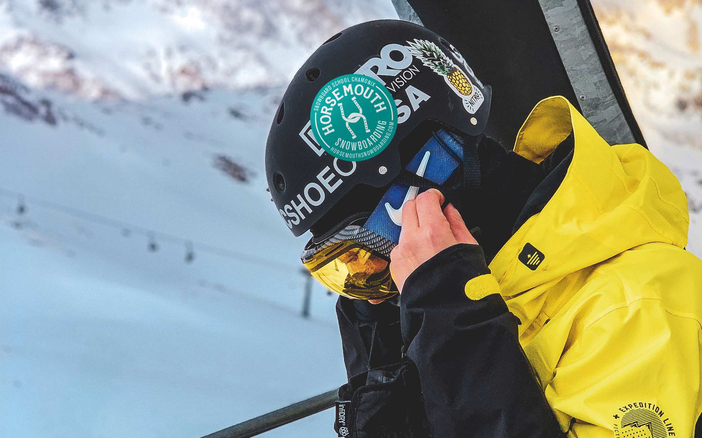
The client wanted something that would stand out amongst the regular extreme sports logos which often consisted of chunky, bold and modern styles. The logo needed to be versatile so that it could sit comfortably in a variety of environments. Everything from flyers and posters that needed to contain the full company details, right down to large board-stickers that would consist of just the company icon.
THE SOLUTION
A clever brand name which leans heavily on the old saying ‘from the horses mouth’ which originated in horse racing. This underlying theme of the brand offered a unique and unusual aesthetic which has been brought out in the form of the horse shoes. This theme has also allowed the brand to be steered away from the generic designs often found in ski and snowboard schools.
